UX Design + Research
Adding delight to a venture capital firm's website.


Project
Over the course of my summer 2019 internship at Divami Design Labs; our task, as a team of 3, was to redesigns a responsive website for our client - Endiya Venture Capital Partners. We envisioned a meaningful theme and a delightful experience for our users.
Context
10-week internship at Divami Design Labs
Team members: Diya Koshi, Aparna Nair
Role
I headed the UX design supervised by a UX manager. I also worked on the style guide along with a senior visual designer


Design process
01
02
03
04
04
06
07
Inclusion criteria: entrepreneurs seeking funding, Endiya's current clients
Key findings from the interview:
-
All the users received funding early on in their journey
-
Portfolio companies appreciated Endiya for:
-
Technical & business background
-
Support & strategies
-
Connection & market outreach
-
Domain knowledge and deep involvement
-
-
Most of the VC firm websites look very similar and users look for a different experience
-
Users mentioned that portfolio companies, domain, and background of the VCs are what they mainly look for
01 Understanding the user
Interviews
Persona
To define our goal, it was imperative to analyze their competition’s online presence, specifically, what their websites had, and what we could do differently.
Key findings:
-
Most VC firm websites look similar and have a similar information architecture
-
Almost all the VC websites have color palettes with greyish colors
-
Animations were present in all the high-quality websites
-
VC websites had a serious connotation and didn't offer a delightful experience
02 Defining the goal
Competitive Analysis
The Goal
-
The firm’s investment thesis
-
Domain and background of each of the VCs
-
List of portfolio companies to reflect alignment with the investment thesis.
Apart from incorporating a theme to help the website stand out, our goal was to encompass the following information:
03 Framing a theme
Ideation
In a typical design process, the information architecture is established before the wire-framing begins. However, as we had to receive the client’s go-signal for the design theme, I had to start by wire-framing various ideas.
Testing Emotions
In order to choose a theme, I tested how users react to the different themes using the 'Bollywood Method' which gauges the reactions of Indian test users as an adaptation of cultural probes pioneered by Bill Gaver [1]. I designed this cultural probe in the form of ‘emotion tickets’. These were designed to resemble the nine ‘rasas’ or emotions used traditionally in Indian performing arts.

A sample of 20 participants was asked to select all emotional tickets they related each theme with. After collecting and analyzing the data, the theme that was associated the most with confidence, peace, love, and joy was chosen.
The Winner
The ‘Sherpa Theme’ was associated with the target emotions by most of the users, and it was one that the Endiya board members loved. Sherpas are Himalayan people renowned for their skill in mountaineering; anyone that wishes to climb Everest will need a Sherpa to guide them. Endiya reflects this relationship by leading its clients through the highs and lows of entrepreneurship. The Sherpa theme depicts this relationship in a delightful manner.

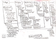
We moved onto outlining the elements of the website, analyzing use cases and user flows. We ensured that the information architecture’s depth was not excessively layered in order to minimize how much a user must navigate through the website in order to achieve their goal.


Final Architecture
04 Designing the website
Information Architecture
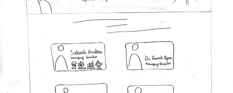
Wireframing
After finalizing the approach and the information architecture, I could proceed with wire framing the whole website for web and mobile
-
The home screen had too many dialogue boxes which increased the cognitive load on users
-
The home screen is missing hierarchy which confuses the order in which users interpret the information present
-
Users wanted easier access to portfolio companies and the VCs
-
Users were unsure of what the 'Expressions' page was
-
The card view on the 'Media' page was too condensed and needed more space
1) Home page:
-
Offer more interactivity and hierarchy
-
Reduce the number of speech bubbles
-
Give a glimpse of the VCs, portfolio companies and media articles
2) Navigation options:
-
The names for each page have to be self-explanatory
-
Move 'contact-us' to the footer to reduce discoverability
-
Combine expressions and media into one page
3) 'About us' page:
-
Remove the team members from the about us page and create a new page for them
-
Add more graphic elements to engage users
4) 'Media' page:
-
Add a tab structure to allow users to switch between blogs, news, and videos
-
Remove the hover effect from the cards
-
Replace grid structure with a list structure
05 Refining the website
User Feedback
Priorities For V2
V2 Wireframes
Home & Navigation Redesign

'Media' Page Redesign

06 Final website
Visual style guide
The visual system needed to be clean and simple while implementing the company's branding colors; these colors are used to establish trust & familiarity by eliciting the right emotions. We chose Open Sans as it is a Sans Serif font that is easy on the eye. Different font weights were used to establish hierarchy.
Colors:
#487AB4
#CC7066
#B6CF91
#B49132
#FFFFFF
#EDEDED
Regular
Italics
Bold
Fonts:
Aa
Open Sans
High-fidelity mock ups


06 Reflection
Over the course of my 10-week internship at Divami Design Labs, I got the opportunity to collaborate and work with some of the most respectful and creative individuals. I was given the freedom to exercise some of my cross-culture knowledge which was very exciting. Interacting with real-world venture capitalists was an intimidating yet thrilling experience. I also learned about managing expectations between the user and the client. Overall, it was an incredibly enriching opportunity that helped me embrace the design culture in India.


